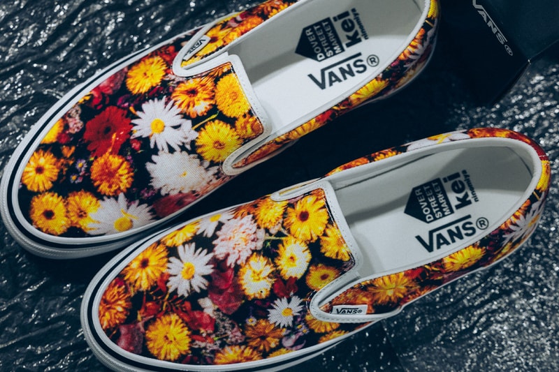
The Vans Slip-On is the most neutral silhouette in American footwear. No laces, no technical claims, no performance narrative. It exists as a canvas, and that blankness is exactly why DSM Kei Ninomiya chose it. The collaboration, revealed backstage at Pitti Uomo 110 this week, applies Ninomiya's signature floral overlays and custom branding to the Slip-On's foundation. The result is a shoe that looks nothing like a Vans product and everything like a Comme des Garçons diffusion exercise.


Ninomiya operates as a satellite of Comme des Garçons, distributed through Dover Street Market and positioned below the mainline in price but not in conceptual density. The label's previous collaborations have followed a pattern: Moncler for outerwear, The North Face for technical shells. Each partnership takes a silhouette with mass recognition and applies an avant-garde filter that limits its audience without abandoning the host brand's retail network. The Vans Slip-On fits this logic precisely. It is the kind of shoe that Vans sells in every mall in America, and the floral treatment is the kind of design that will never see a mall in America.
The presence and preference gap here is deliberate. Vans is named everywhere, worn everywhere, filed under skate heritage even as its market has long since drifted toward general lifestyle. Ninomiya is named in fashion coverage and worn in a much narrower corridor. The collaboration places a cult-tier design language on a mass-market base, and the question becomes: who is the buyer? The Comme des Garçons archive collector who does not own a Slip-On? The Vans loyalist who has never heard of Pitti Uomo?
The answer is likely neither. Collaborations at this level function as brand positioning more than sales drivers. Vans gets to claim a Pitti runway moment. Ninomiya gets to demonstrate that the label's codes can survive transplantation onto an American canvas. The units shipped matter less than the images circulated. Backstage photography carries the collaboration further than wholesale orders ever will.
This is the logic of preference mechanics operating at the diffusion tier. The product is designed to be seen more than worn, discussed more than purchased. The floral overlays make the Slip-On unrecognizable to the customer who buys the silhouette for its invisibility. The custom branding makes it legible to the customer who already knows Ninomiya's handwriting. The gap between those two audiences is the collaboration's purpose, not its problem.
Release dates and pricing remain unconfirmed, which is itself part of the strategy. The longer the images circulate without commercial availability, the more the collaboration functions as editorial rather than retail. When the shoes do arrive, they will land in a market already saturated with images. The buying decision will be made before the product drops. That sequence, visibility before availability, is how preference is manufactured in a market where presence is infinite.